

Removing complexity with container size queries
📦 Container Size Queries in CSS are exceptionally helpful when building dashboards. Especially when they are user configurable. Imagine a scenario where the same component can be placed multiple times, displaying different information and having different column-span settings. Or just being used in the sidebar as well as in the main content area depending on the page.
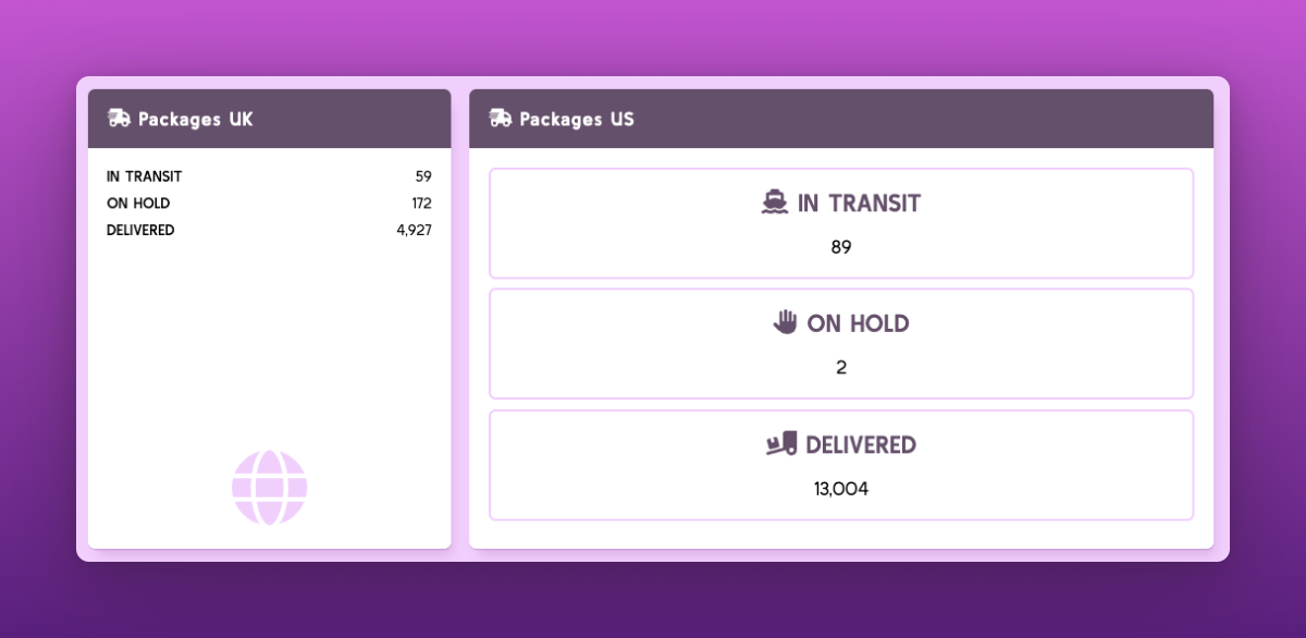
Here we use the same component in two different places with different column-span. They show us information in different formats:
✅ Lets use a container query and define the container type. Figuring out where to set a container type like container-type: inline-size can be a challenge when creating the component.
.item {
  background-color: white;
  border-radius: 6px;
  overflow: hidden;
  box-shadow: var(--shadow-elevation-medium);
  container-type: inline-size;
}

@container (min-width: 400px) {
  .shipping__line {
    flex-wrap: wrap;
    border: 2px solid #f1cffc;
    border-radius: 6px;
    padding: 1rem;
    gap: 1rem;
    text-align: center;
  }
}
Extending this a little bit more we can easily build our multi-use dashboard components – and not worry about device size & adding and removing complex extra classes.
There is also the possiblity to use style queries in addition, to offer even more flexiblity to the user without much effort. Ahmad Shadeed has written a fantastic article on that with quite a lot of use cases and examples.
For any questions ping me on twitter here 🐦